 Storeboard
/App Store icon size
App Store icon size: every iOS and Google Play icon spec (2026)
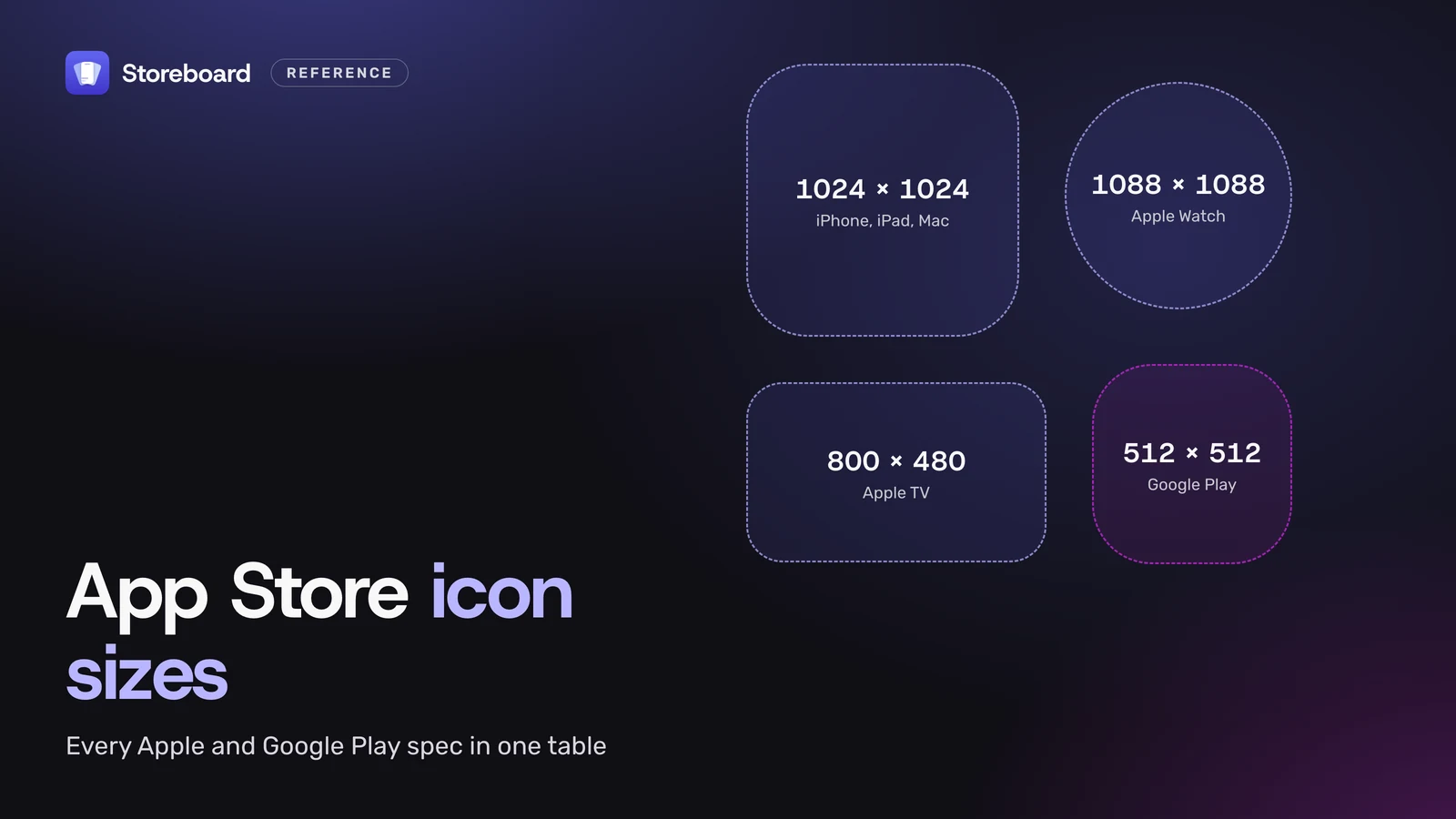
The App Store icon size is 1024 × 1024 pixels for iPhone, iPad and Mac apps. You give Xcode one square image or an Icon Composer file, and the system rounds the corners and makes every smaller size for you. Apple Watch icons are 1088 × 1088, Apple TV icons are 800 × 480 with layers, and a Google Play icon is a 512 × 512, 32-bit PNG of up to 1,024 KB. Below is one table with every platform, linked to the official spec, then what Xcode still needs from you, what changed with layered Liquid Glass icons, and the upload errors and App Review guidelines that get icons bounced.
Every number comes from Apple's Human Interface Guidelines for app icons (last updated by Apple on 28 October 2026), Xcode's documentation and Google's Google Play icon design specifications, read on 12 November 2026.
On this page
What size should an App Store icon be?
1024 × 1024 pixels, square, for iPhone, iPad and Mac. That one image is the master: the system applies the rounded-corner mask and scales it down for the Home Screen, Settings, notifications and search. Other platforms have their own master size.
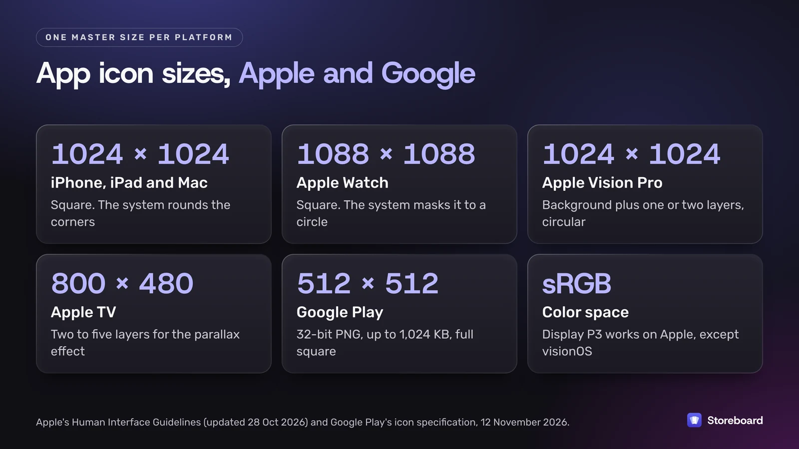
| Platform | Size | Shape after masking | Style |
|---|---|---|---|
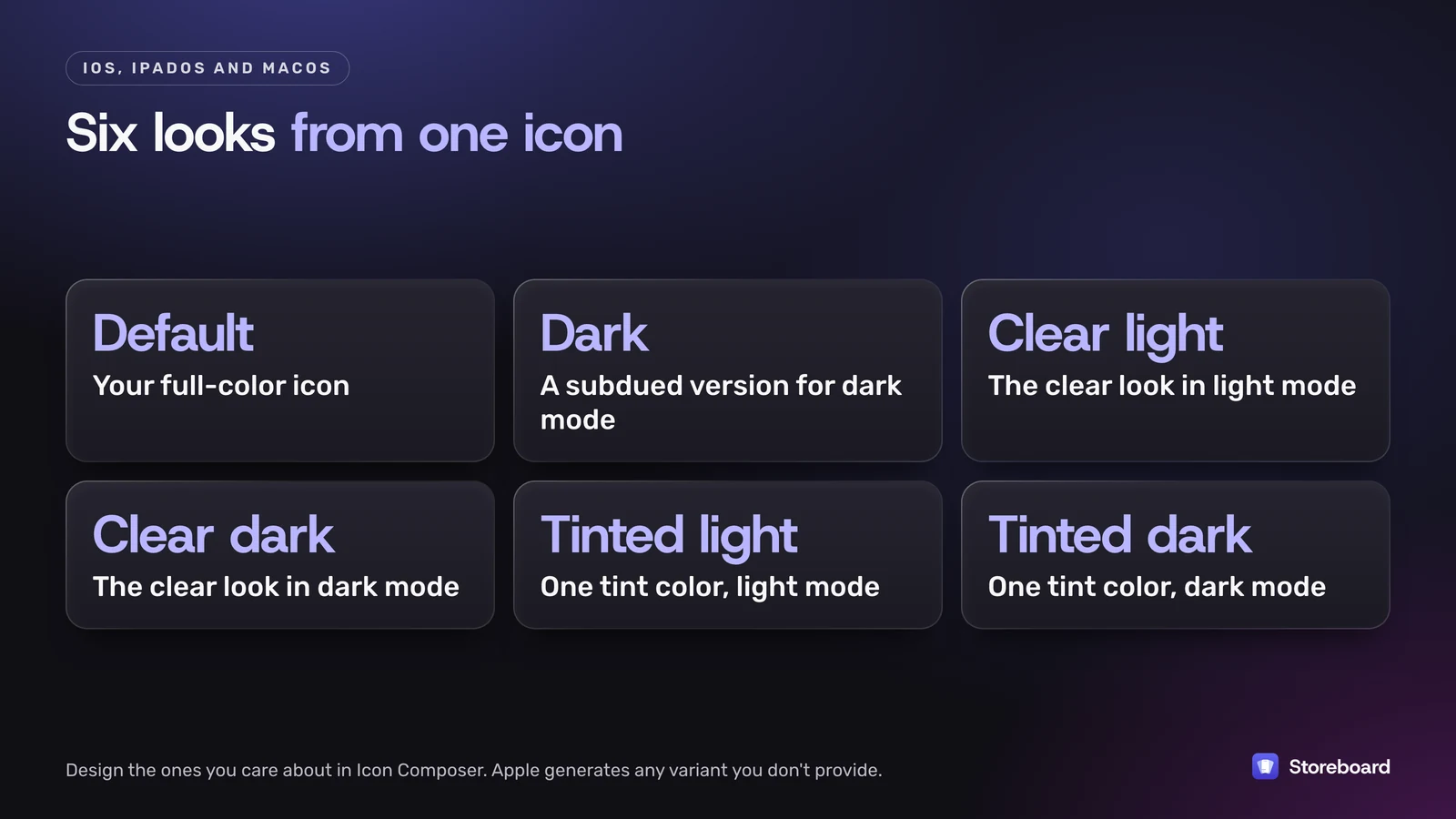
| iPhone, iPad, Mac | 1024 × 1024 | Rounded rectangle | Layered. Six appearances: default, dark, clear light, clear dark, tinted light, tinted dark |
| Apple Watch | 1088 × 1088 | Circle | Layered |
| Apple Vision Pro | 1024 × 1024 | Circle | A background layer plus one or two layers on top (3D) |
| Apple TV | 800 × 480 | Rounded rectangle, landscape | Two to five layers for the parallax effect |
| Google Play | 512 × 512 | Google rounds the corners (30% radius) | 32-bit PNG, sRGB, up to 1,024 KB, full square |
The Apple sizes are from Apple's own specification table. Apple supports sRGB, Gray Gamma 2.2 and Display P3 color profiles for icons, with Display P3 on every platform except visionOS.
Where does the App Store get your icon from?
From your app build. There's no separate icon upload in App Store Connect for an iPhone, iPad or Mac app: the store shows the icon inside the binary you submit. Two practical consequences. Changing your App Store icon means shipping an update, and an icon problem shows up as an upload error from Xcode or Transporter rather than as a field you fix on the web.
Two things to leave out of the artwork itself: rounded corners and drop shadows. Apple and Google both add those on their side, and baking them in gives you a blurry double edge.
Which icon sizes does Xcode still need?
For iPhone, iPad, Apple TV and Apple Watch apps, Xcode can make every size from a single 1024 × 1024 image, and that's the default for new projects. Apple's Xcode documentation is explicit: "iOS, iPadOS, tvOS, and watchOS apps can auto-generate all icon variations from a single 1024×1024 pixel image."
- Single size is the setting in the asset catalog's Attributes inspector. Switch to All Sizes only if you want hand-tuned small versions.
- Mac and Apple TV asset catalogs still take an image for each size if you use a classic asset catalog icon rather than an Icon Composer file.
- Vision Pro takes a single 1024 × 1024 image, built from layers in an image stack.
- Dark and tinted versions on iPhone and iPad go in the same icon set. Xcode asks for the dark icon with a transparent background, so the system's background can show through, and the tinted icon as a grayscale image.
If you're coming back to an old project with twenty icon files in the asset catalog, you can switch it to Single Size and delete the rest. Keep a copy first, then check the result in the simulator before you ship.
What changed with the latest icon format?
Icons are now layered. For iPhone, iPad, Mac and Apple Watch, Apple's recommended route is an Icon Composer file: a single file with a background and foreground layers that the system renders with Liquid Glass effects like highlights and translucency, at every size and in every appearance.
- Where it lives: Icon Composer comes with Xcode. Choose Xcode > Open Developer Tool > Icon Composer.
- Canvas size: 1024 × 1024 for iPhone, iPad and Mac, and 1088 × 1088 for Apple Watch.
- Artwork: design the layers in your usual tool and export them as SVG where you can, PNG for anything SVG can't hold. Convert text to outlines, and don't export the mask.
- Appearances: people can choose default, dark, clear or tinted icons on their Home Screen. You can design each variant, and the system generates the ones you don't.
- Older systems: if your app supports earlier OS versions, Xcode generates a flat icon for them from the same file at build time.
- Still a plain PNG? That's allowed. Apple says the system then tries to split it into a background and a foreground itself. Use Icon Composer if you want control over which parts get the glass treatment.
Apple TV and Vision Pro don't use Icon Composer: their layers go into an image stack in the asset catalog.
How should you test a new icon?
At the size people actually see it, next to other apps. Icon Composer previews each platform and appearance, and Apple suggests checking on a simulated device in Device Hub or on a real phone too. Look at three things: whether the main shape still reads in the small Settings and notification sizes, whether the dark and tinted versions are still recognizably yours, and whether thin lines or small details disappear. Apple's guidance is to keep the idea simple, avoid very thin lines, and not use photos or screenshots of your app as the icon.
What size is a Google Play app icon?
512 × 512 pixels, as a 32-bit PNG in sRGB, no bigger than 1,024 KB. Upload a full square: Google Play adds the rounded corners itself, with a radius of 30% of the icon's size, and adds the shadow too.
- Fill the square with a background color. Transparent areas show Google Play's own background.
- Keep logos on the keyline grid rather than stretching them to the edge, unless your artwork is an illustration that works full bleed.
- No ranking or deal badges. Google doesn't allow text or graphics in the icon that suggest a ranking, a deal, a Play program or anything else that could mislead.
- This isn't your launcher icon. The adaptive icon inside your Android app has its own rules. The 512 × 512 file is only for the Play listing.
What gets an app icon rejected?
Most icon problems show up as upload errors before App Review ever sees the build. The rest are App Review Guidelines.
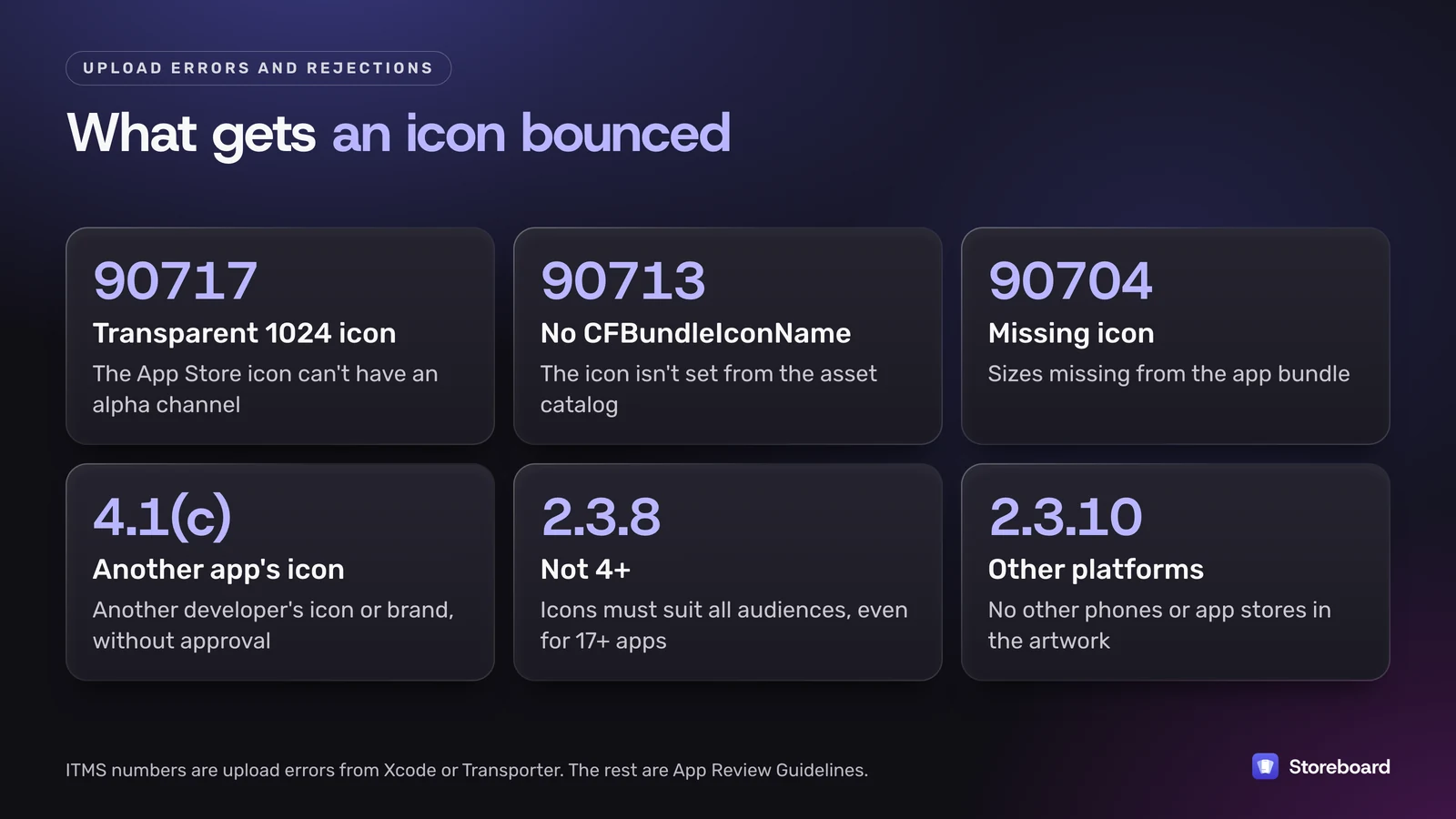
- A transparent App Store icon. The upload error ITMS-90717 means your large icon has an alpha channel. A layer with transparency or blur left in can cause it.
- The icon isn't wired up. ITMS-90713 (missing CFBundleIconName) and ITMS-90704 (missing icons) usually mean the icon set in your asset catalog isn't the one the target uses.
- Someone else's brand. Guideline 4.1(c): "You cannot use another developer's icon, brand, or product name in your app's icon or name, without approval from the developer." Apple's design guidelines also say not to use replicas of Apple hardware.
- Not suitable for everyone. Guideline 2.3.8 says icons, screenshots and previews must suit a 4+ age rating even if your app is rated higher, and that your small, large, Apple Watch and alternate icons should look alike.
- Other platforms. Guideline 2.3.10 bans icons or imagery of other mobile platforms or app stores in your metadata. A phone that's clearly not an iPhone in your icon counts.
A quick check before you upload
- The master is 1024 × 1024 (1088 × 1088 for Apple Watch), square and unmasked.
- No alpha channel in the flat App Store icon.
- No rounded corners, drop shadows or glows baked in.
- The icon set the target uses is the one you edited.
- Dark and tinted versions checked, or happily left to the system.
- Nothing borrowed: no other app's brand, no Apple hardware, no other phones.
- For Google Play: a separate 512 × 512 PNG under 1,024 KB, full square.
Not a rule, but worth it: Apple's guidelines say to include text "only when it's essential". A word at icon size is usually unreadable, and your app name sits right under the icon anyway.
The icon is done. Now the rest of the page
Storeboard: ASO Assistant doesn't design app icons. It does the rest of your App Store page: screenshots at Apple's exact sizes, the name, subtitle and keyword field, translations into every App Store language, and publishing to App Store Connect. Free to start on the Mac App Store.
Questions
Is the App Store icon 1024x1024?
Yes. iPhone, iPad and Mac app icons are 1024 × 1024 pixels, and Apple Vision Pro icons are too. Apple Watch icons are 1088 × 1088 and Apple TV icons are 800 × 480. Xcode makes every smaller size from that one image.
Can an app icon have transparency?
The flat App Store icon can't: an alpha channel triggers the ITMS-90717 upload error. Layered icons are different. Foreground layers in an Icon Composer file can be translucent, and Xcode asks for the dark iOS icon with a transparent background so the system background shows through.
Do I need separate icons for dark mode?
No, but you can make them. iPhone, iPad and Mac icons have default, dark, clear and tinted appearances, and the system generates any you don't design. Design the dark one yourself if the automatic version loses your brand colors.
What's the Google Play icon size?
512 × 512 pixels, a 32-bit PNG in sRGB, up to 1,024 KB. Upload a full square without rounded corners or a shadow, because Google Play adds both.
Does Storeboard make app icons?
No. Storeboard: ASO Assistant works on the rest of your App Store page: screenshots, the name, subtitle and keyword field, translations and publishing to App Store Connect. For the icon itself, use Apple's Icon Composer or your usual design tool.
Sources
Pages read on 12 November 2026 (Melbourne time).
- Apple Human Interface Guidelines: App icons
- Xcode: Configuring your app icon using an asset catalog
- Xcode: Creating your app icon using Icon Composer
- App Review Guidelines
- Google Play icon design specifications
- Google Play Console Help: Add preview assets