 Storeboard
Storeboard/App Store screenshot templates
App Store screenshot templates (2026)
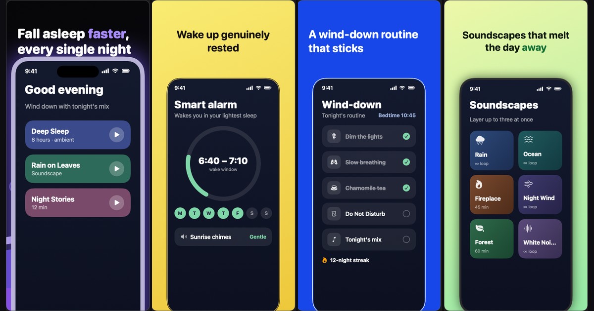
20 designed looks that turn raw screenshots into a finished App Store set — applied in one click, adapted per device, translated per language, exported at Apple's exact pixel sizes.
A screenshot template worth using is a system, not an image: it styles your whole set — backgrounds, captions, device frames, decorations — consistently, and keeps working when you add a language or an iPad set. Storeboard ships 20 such looks; the first three are free, every look is previewable on your own screens, and one click restyles every screen in every language.
On this page
What a screenshot template actually is
Most things sold as "App Store screenshot templates" are static design files: a Figma or Sketch page with device frames and placeholder text. They look great in the preview — and then every real screenshot, every device size and every language becomes manual work inside a design tool, with Apple's pixel requirements enforced by nobody.
A template in Storeboard is a design system applied to your project. It sets the background gradients, the caption typography (weight, case, per-word highlights), the device frame finish, the layout rhythm across the set — first screen a hero, then alternating layouts so the set reads as a designed sequence rather than ten copies of one frame — and the decorations: numbered steps, laurels, star ratings, arcs and doodles, placed to clear the device on every screen.
Because it's applied to live screens rather than pasted into an image, the template survives change. Swap a screenshot, edit a caption, add German — the look holds.
The 20 looks
Three are free for every user — enough to ship a complete, designed set without paying anything. The remaining seventeen are part of Storeboard Pro (a one-time purchase, not a subscription). All twenty can be previewed on your own screenshots before applying.
| Look | Style | Access |
|---|---|---|
| Onyx | Black stage, numbered violet steps | Free |
| Sprout | Lime energy, ink type, sticker frames | Free |
| Violet | Heavyweight caps on alternating violet | Free |
| Prisma | Vivid haze, hairline glass frames | Pro |
| Sorbet | Hue-shifting pastels, outlined screens | Pro |
| Custard | Flat pastel steps, black hairlines | Pro |
| Billboard | Your caption words, poster-sized | Pro |
| Graphite | Night hardware, two-tone captions | Pro |
| Porcelain | Gallery white, icon-led | Pro |
| Orbit | Charcoal grain, tracked caps | Pro |
| Cobalt | Electric blue, pages that invert | Pro |
| Breeze | Powder blue, rounded ease | Pro |
| Zine | Brutalist caps, gradient blobs | Pro |
| Pulse | Violet voltage, numbered steps | Pro |
| Ivory | White space, quiet authority | Pro |
| Showroom | Grey studio, product first | Pro |
| Moss | Olive black, lime signals | Pro |
| Taffy | Soft pastels, cards on a tilt | Pro |
| Sketch | Notebook doodles, marker green | Pro |
| Nebula | Deep-space dust, lime signals | Pro |
The roster deliberately spans the styles that convert in different categories: dark, high-contrast looks for utilities and dev tools; pastel systems for lifestyle and health; white gallery looks for premium and productivity apps; loud poster type for consumer apps that live on a single claim.
One template, four device families
Apple stores screenshots per device family — iPhone, iPad, Mac and Apple Watch each keep their own set. A design that works on a tall iPhone canvas breaks on Mac's landscape 16:10, and drowns an Apple Watch frame. Storeboard's looks adapt themselves per device instead of scaling one artwork:
- Mac: 3D tilt flattens, layouts recompose for landscape, captions cap their length.
- iPad: layouts remap so captions never collide with the bigger frame.
- Apple Watch: captions shorten and decorations clear the small round-cornered frame.
The result is one visual identity across your whole product page — the thing shoppers actually notice — without designing four separate sets.
Everything stays editable
Applying a look is a starting point, not a lock-in. Afterwards, every caption, gradient, frame and decoration is a normal, editable element. Two customizations matter most in practice:
- Icons: several looks use accent icons. Any of them can be swapped from a built-in catalog of 250+ searchable icons across 13 categories (shopping, finance, health, travel, media, productivity and more) — or replaced by dropping in any PNG of your own.
- Words: looks like Billboard build their poster art out of your caption words. Change the caption, the design changes with it.
And because templates are non-destructive, applying a different look later restyles the same screens — trying all twenty on your real screenshots takes minutes, not a redesign.
Try all 20 looks on your own screenshots
Drop your screens in, preview every look, ship the free ones today. Everything renders on your Mac — nothing is uploaded anywhere.
Download for MacTemplates vs. Figma files
If you love design work, a Figma template is a fine canvas. The trap is scale. The App Store stores screenshots per localization, so a 10-screenshot set in 15 languages is up to 150 frames — each needing its caption replaced, its overflow fixed (German runs 30–40% longer than English), and its export checked against Apple's exact pixel sizes, where one wrong dimension bounces the upload.
| Figma template | Storeboard look | |
|---|---|---|
| Apply design | Manual, per frame | One click, whole set |
| New language | Duplicate + retype every frame | Captions translate in place |
| Long translations | Fix overflow by hand | Auto-fit within the line budget |
| iPad / Mac / Watch | Redesign per canvas | Look adapts per device |
| Export sizes | Your responsibility | Apple's exact pixels, always |
| Design freedom | Unlimited | 20 systems, fully editable after |
More on this trade-off in the full screenshot tools comparison.
Templates × languages: where the leverage is
The quiet advantage of a template system is what happens when you localize. Since the look styles live captions rather than baked images, translating your captions into every enabled App Store language keeps the design identical everywhere — and Storeboard exports each language's finished set in one pass. That's the difference between "we should localize screenshots someday" and actually shipping localized screenshots, which is one of the most under-used conversion levers on the App Store.
FAQ
Are the templates really free?
Three of the twenty — Onyx, Sprout and Violet — are fully free, including export. The other seventeen preview on your screens for free and unlock with Storeboard Pro, a one-time purchase (no subscription).
What sizes do templates export at?
Apple's exact required dimensions for every enabled device — iPhone, iPad, Apple Watch and Mac — selectable at export. See the full size reference.
Can I change a template's colors, fonts or icons?
Yes — after applying, everything is a normal editable element: captions, per-word styling, gradients, frames, decorations. Template icons swap from a built-in catalog of 250+ icons or any PNG you drop in.
Do templates work with screenshots I already have on the App Store?
Yes. Import your live listing — no API key needed — and your existing screenshots and metadata land in a ready project. Apply a look, and your current set gets a redesign in minutes.
Will my app look like everyone else's?
The looks style your screens, captions and colors of emphasis — two apps on the same look share a rhythm, not an appearance. And every element stays editable, so drifting away from the starting point is the normal path, not a workaround.